Jamie Brewster contacted me to create a meaningful minimalist logo design for her new business, Birthed in Love, a full spectrum doula service. Sometimes, minimalist logos can feel a bit flat and lifeless, but this logo is full of life. We started the logo with the intent that it be hand drawn from start to finish. Few things enliven a logo more than a hand drawn touch. I set to work on an organic minimalist logo to communicate Birthed In Love’s core values: empowerment, love, and honesty.
Concept Sketches Round 1
“I spent some time sketching and I came up with 3 concepts. As you’re an artist and for the sake of saving time, I think you’ll be able to gage enough from these unpolished drawings to see which direction you like.
I started with your idea of using a B as a heart. But I couldn’t shake Burlington Coat Factory from my mind. So I started thinking, what if we make the B more organic, and also evoke the profile of a pregnant woman? This shape combines the heart and the letter B and the shape of a pregnant woman. This feels confident and calm.”

Here is another variation on the pregnant B but with the heart as a fetus. The lettering around her feels safe.

Focusing on the message of empowerment, I came up with the idea of this pregnant B surrounding bold and confident lettering, either as an outline or as a color in line with your color scheme with white lettering for a clean feel.

Sketching Round 2
Jamie introduced the concept of the B + heart, but when I initially tried it, it reminded me of the Burlington Coat Factory logo, hence my suggestion of a organic letter B shape. Jamie wanted to explore this idea further, so I got out my markers and set to work.
I see sample 2 as particularly strong, while example 6 feels honored and safe. Sample 4 could be strongly influence by whatever type is used. Sample 7 is meant to communicate the composition of a pastel shape behind louder text.

Suddenly, Inspiration Struck!
I sent off the above concept sketches when inspiration struck! I quickly drew this and emailed it a few minutes later. She loved it! We had our minimalist logo design icon.

Round 3 Lettering Concept Sketches
Before moving forward, we tested the design with a subtle nose and played around with lettering ideas. Jamie grew up with a sign painter in the family, so she appreciated the process of working with hand drawn sketches. She originally considered a 100% hand drawn logo, so I set to work on a polished version with the materials around my father’s house. I worked without my studio during the weeks we spent waiting out the fires that hit California during the summer of 2020.

Illustrator Logo Samples
We decided to look at her logo in illustrator. I kept the subtle inconsistency of line to preserve the hand drawn feel. Imperfection add an energy to designs. In a digital world where everything is smooth and vectorized, logos that preserve elements of human touch feel more alive and stand out from the crowd. This liveliness was particularly important for Jamie’s logo because of her line of work. The version on the left is particularly imperfect, while the other samples are less so. The middle font is my hand drawn homage to the typeface on the right.
Here are 3 versions of the logo. I used vintage desert postcards and desert photos as reference to create a few desert color schemes. The first typeface is called Fabada, which you can find for free on myfonts.com. The second logo uses Comfortaa which is also free. These will be good options for your site. I do build WordPress sites and would be happy to create yours if you go that route.


Wrapping Up the Logo Design Process
Before committing to a color, Jamie wanted to hold the colors in her hand. She used Benjamin Moore paint swatches to help her select her brand colors. I’m glad I work in a collaborative way that encourages this level of care and attention in my clients. Using her palette, I created these combinations.

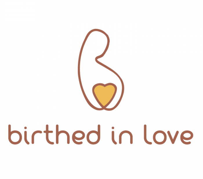
The Final Logo Design
Now that’s a minimalist logo design that’s pregnant with meaning. Birthed in Love is an inclusive full spectrum doula service owned and operated by Jamie Brewster in Los Angeles, California. Visit her website and follow the Birthed in Love page on Facebook.

Ready to start your logo design journey? Fill out the New Logo Client Form today.