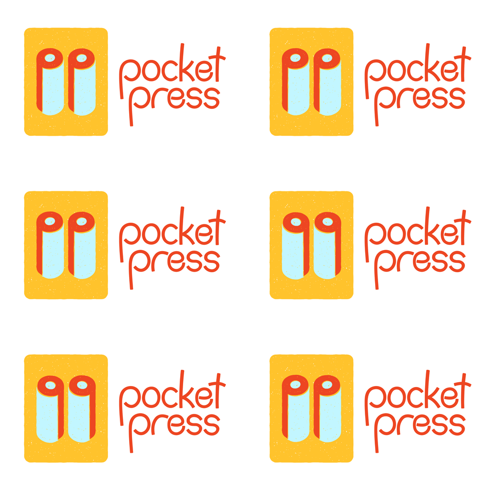
The Pocket Press is a personal project, so I wanted to make a fun logo layered with meaning. The pocket press is a mini printmaking press I’ve made for my fellow printmakers since 2015. I echo the initials, pp, as shading of the cylindrical press rollers in the logo icon. I use a subtle stamp effect in the icon to give it a hand printed look. The different color “layers” are slightly offset, to reference reductive printmaking. This is also a nod to relaxing and enjoying the printmaking process. Printmaking is fun, but printmakers can seek perfection in a human process. My logo is about embracing the process and having fun.
I started to create this cheerful font last year, and I am pleased it found a home in my own project. For an added layer of playfulness, I animated the rollers.


As part of my evolving branding, I created this long ink swath. This is created when the printmaker “warms up” their ink for the brayer (ink roller).

