Cat Moore is the Director of Belonging at USC. She is the creative mind behind several projects all centered on her very timely mission to help people connect. Cat reached out to me to help her visually unite her projects and create a logo reflective of her personality. If you’ve been following my work, then you know the heart of my logo design process is a conversation with my client.
How My Logo Design Process is Different
Most logo designers start by creating 3 complete vector logos based on their client’s initial feedback. The problem with this approach is- making changes to completed logo files is time consuming and can get expensive. Sometimes, a logo designer happens to create 3 logo samples their client does not really like. By then, it can be too expensive or time consuming to try again. This is why I save time by creating sketches first. Sketches are fast and far less time consuming to edit than completed vector logo files. If the client has a look or vibe that takes a few tries to perfect, working together on several rounds of sketches is far more affordable than building more new logo files in Illustrator.
Cat’s Sketches
Before designing her logo, Cat and I needed to pin down an approach for visually uniting her projects. I suggested we accomplish this either by using the same style to create a family of symbols, creating a symbol to pop up inside each logotype logo, or uniting a look by illustration style and typeface. Here are some of my initial logo and branding concept sketches for Cat, accompanied by an explanation of the thought process behind them. I come from a drawing and painting background. Paintings begin with layout sketches and contemplation on their deeper meaning. The logo design process is not so different.


“My second idea is to create logotype logos for each project (that means a text based logo) but to use this bird as an identifying branding element. Birdie can pop up in any logo to let people know this is a Cat Moore project. I like the bird as an icon for you because birds call to communicate- to connect- and it’s through their calls that their find where they belong.
I did some thinking on what you do and what that evoked for me, visually. I had the idea to use a bold retro text to evoke the friendly, caring and self help vibe of the 70s. Things like Mr. Rogers and Free to Be You and Me, and an explosion of self help and self discovery fiction book covers that came out in the 70s. You’ll see I felt inspired to draw these Shel Silverstein like illustrations. Together these are too complex as part of the logo, but can work as branding elements to use to adorn your site, pamphlets, or anywhere. “
Where the Sketches Lead
Sunshine is the best painter.
Antoni Gaudi
Sketching first means that when inspiration hit, we had the flexibility to pursue a new direction without losing any time or money. The sun icon I drew as a part of the above idea sparked a new train of thought. Cat loves the work of Antoni Gaudi, and sent me photos of his architectural masterpiece, La Sagrada Familia in Barcelona, Spain. One of the photos Cat sent included sun shaped stained glass windows. If I had created completed vector files from my initial ideas, we would not have had the flexibility to change directions without a complete overhaul.
I quickly designed a friendly Gaudi inspired sun. I love this idea of the sun visually because I see the negative space as pathways all connecting to the inner circle (of belonging). The samples include a few different type treatments for reference. I found Cat an uncommon font that has a warm retro feel, but is also bold and professional.
Cat suggested longer sun rays and we tried a few effects from basic gradients to wood grain. We knew we needed a compelling effect to really make this sun shine.


The Completed Logo
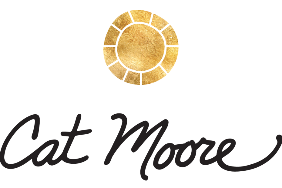
For Cat’s main logo, we settled on this glittering gold effect accompanied by her signature. Her satellite projects will be marked by this sun and the use of her unique font (below). Learn more about Cat Moore and her human connection minded projects on her website www.cat-moore.com.


Are you ready to start the conversation that will lead to your own unique logo design? Fill out the Logo Design Client Form.

