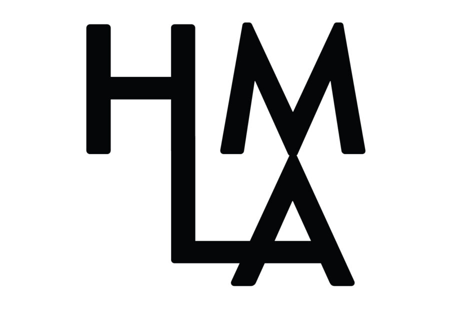
My client, Handmade Market LA (HMLA) knew what they wanted- a logo design that focused on their initials and did something creative with them. It makes it much easier as a designer to know these details, as there are myriad ways to make a logo. Some logos are made using the whole name. Some logos incorporate or are comprised solely of a symbol, and what that symbol can be ranges from a letter or object to an abstract shape. Knowing that the client specifically wanted a letter based symbol almost made my job easy. Almost.

I created a presentation with color scheme selections and several designs to choose from. In every presentation I make, I always include a black and white sample of the logo. This is the version that they fell in love with. I agree that it’s also the best choice for their bold, Los Angeles vibe.

There is so much creativity in design. Their desert and weaving inspired color schemes won’t be used in their everyday logo presentation, but they will be incorporated in other media. Stay tuned. In the meantime, let’s take a look at my process as well as the rejected designs, just for fun.

Before I begin any work on the computer, I read all the notes about a job and have a massive brainstorm. The idea here is to get out all of my ideas, and visually play with the forms and ideas to see what design discoveries I make. At this point I don’t worry about whether the idea is good or is in the style the client wants. I just get it all out there. On paper. When I reach the end of my brainstorm, I open up Adobe Illustrator and begin building.

This logo design is all about doing something creative with the letters, using just H and M in this case. The H’s long cast shadow creates an M.

A personal favorite- this logo symbol combines the H and the M in a rustic way, as if formed by 2 sticks, referencing the handmade element of the market.

One thing I really love about design are these little discoveries about things you look at everyday but don’t see- like that M can actually fit in the negative space along the top of a capital H.

I consider this logo design a variation of the previous one. It’s more blocky and abstract, which is one of the elements I was going for, though perhaps too much in this example.
I really enjoyed working with HMLA. Their next market is in Atwater Village in the Hugo’s Taco’s parking lot this December 8. Be sure to come say hello to me. I’ll be selling some of my original designs and sharing a table with my friend, Curiouser 74. Learn more about Handmade Market LA by visiting their website at www.handmademarketLA.com.
Like what you see? Contact me about designing a creative and iconic logo for you.
Written by Diana Kohne. Diana is a graphic designer in Pasadena, CA. Keep in touch through Instagram or sign up for the newsletter below.
[sibwp_form id=1]


I love your design, and that last logo idea is sublime!
Thank you! I love all of these logos. This is what I send around when I want people to see what my work is like.