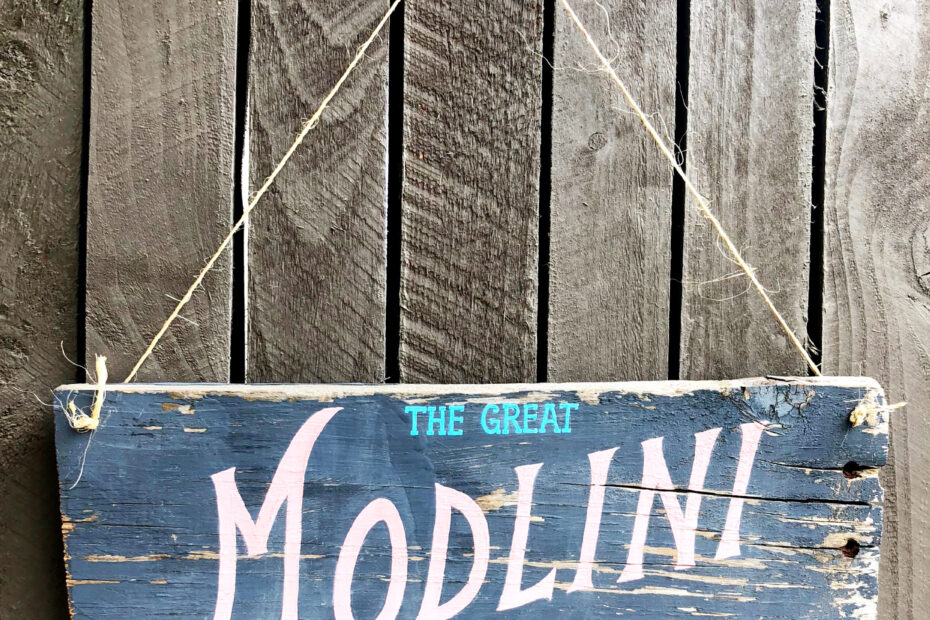
A music teacher commissioned me to make this custom sign for her classroom. I started by asking her for images of her classroom. This set the color scheme.
For font inspiration I looked at the cover designs of old sheet music and at circus posters from the early 1900s as well as posters specifically for Houdini! I drew a few quick thumbnail sketches by hand so she could tell me which direction to go in.

After that, I proposed a complete design with a color scheme inspired by her classroom. I offered alternate wood and color scheme suggestions in case she preferred a more rustic look.

She elected to keep the wood mostly as is, and opted for my recommended color scheme. It was a pleasure to work on such a fun and meaningful project. When using reference photos instead of computer fonts, sometimes missing letters have to be invented. I designed the M and the L based on the letters of the script I had.

Just for fun, she made this a reversible sign with the other nickname her students have for her on the back.

Written by Diana Kohne. Diana is a graphic designer in Pasadena, CA. Keep in touch through Instagram or sign up for my newsletter below.
[sibwp_form id=1]

