I share the creative side of how to make a logo in this blog about the logo I designed for Ruth Lane Games, an online retro game shop operated by by Andrew Ehmann. I also include a few tips for non designers seeking a guide for building a logo on their own. I’ve been designing logos long enough to recognize and outline the general steps and I share them here in order. Whether you’re a designer working in illustrator or a non designer wanting to create a great logo on your own, my process, tips, and information about alternative software will help you create a personal and meaningful logo.
Look at Logos by Your Business Peers
When you study your peer logos, the objective is to see if there is a customary logo format for your field. You never want to look to other logos for inspiration because you want yours to be nothing like the logos of your competitors. You distinguish your brand by focusing on your individuality. You can’t stand out if you look like someone else.
When I made the logo for Ruth Lane Games, I looked at other vintage game shop logos. I studied current peers as well as potential peers. You want a logo that you can take with you as you grow from vide game hustle to full time video game shop.


Most of the video game shop logos feature text plus logo. So I recommended a combination icon and logotype logo for my client. That simply means a logo that consists of text and an icon. Some logos are logotype. This means their logo is text based with no icon. Study your field and choose a logo set up that fits in among your peers.
Look to Your Core Values for Inspiration
Your core values are the heart of your company, and while branding may change over the years, your logo stays more or less the same. The logo stays timeless because it captures your core values, and those don’t change. These are the things that make your business different from the others so when you draw you inspiration from them, the result is a totally unique representation of you. For my client, video games are a lifelong passion. His name reflects the nostalgia of his childhood. I decided his logo should too. I proposed that we combines the nostalgia of video games with nostalgia from his childhood. We decided to focused on Blade Runner, retro video game logos, and Mr. Beaver, a squirrel that he used to feed as a child.


Try a Few Ideas
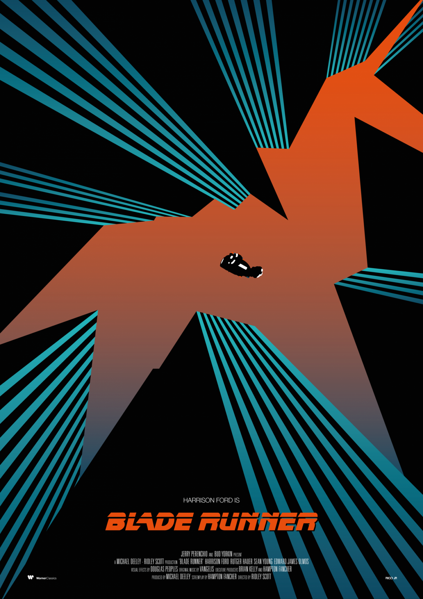
First, I built a vector Mr. Beaver inspired by the retro Blade Runner poster. I wanted to capture that quality of 80s graphics. While designing it, I started thinking about retro arcades, and tried out a neon Mr. Beaver. Can you look at retro games without thinking about pixellated characters? No! I designed several variations of pixel Mr. Beaver, inspired by early Mario and Space Invaders.
You’re Not Limited to Adobe Illustrator
Don’t give up because you don’t have fancy software. You can follow this step in a sketch book, keeping in mind that you want your logo art to be made from simple shapes or lines without too much detail. Try cutting paper shapes to keep colors uniform and shapes simple. I created the pixelated Mr. Beavers with a free app pixel art app because it was the best tool for the job. If you are inclined, explore vector building alternatives to Illustrator like Inkscape or Vectr, or entirely different free art making apps like PixilArt.

Choose the Most Iconic Logo Icon
My favorite logo icon (the last pixel Mr. Beaver) is not the most iconic. And that’s ok. The objective here is to create an icon that is instantly recognizable and instantly remembered. The simpler, the better. This is a good time to talk to your friends and see what designs they respond to. Also, if someone says, “what is that?” you should probably toss that option entirely. My client chose the solid red orange pixel Mr. Beaver and it was a good decision.
Look at Type
We didn’t use that rad 80s graphic look for the icon, so I researched Blade Runner movie title inspired fonts. As luck would have it, a Blade Runner movie title inspired font by Phil Steinschneider is available on dafont.com for free, even for commercial purposes. There are thousands of free fonts available for use. It’s important to make sure these are free for commercial use before using them in your logo. There are also many books on hand lettering. A hand lettered logotype is sure to stand out from the crowd.
Adjust the Type to Suit Your Logo
I made some changes to the font legibility. You’ll see the white only goes through letters that would have a significant gap across the top. I adjusted this gap size as well. These are all little changes that come naturally by looking at the letters frequently over a period of time.
Try Different Combinations
I also tried my idea to balance the radicalness of the Blade Runner inspired font with Andrew’s handwritten word. The idea was to connect to the human behind the operation, the person who inspects every day. You’ll see another variation on this idea of a very cool font with something more upbeat.
Wait a Few Days to Allow for Inspiration to Hit Before Moving on to the Next Step
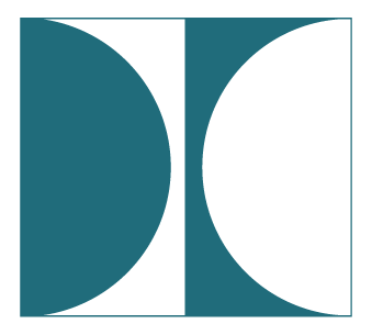
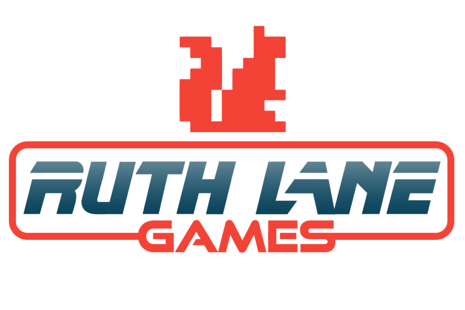
Always allot time for the creative process. Just before I was going to send my designs, I was struck with this idea to build a totally awesome combination logo that paid homage to retro video game logos with a border around the letters. I had originally tossed out the retro border idea when we decided to move forward with an icon based logo. As a logo designer I usually strive for simplicity, but for this gig, I knew it was ok to play around. Modern logos tend to leave borders and embellishments behind but this was my chance to add a border and go wild and old skool with a gradient on the letters. My last design is the one my client chose.

Fine Tune and Create Variation
Even when you think you have your final design, try a few alterations. I experimented with outline weight and made other slight alterations like improving the letter spacing.
Why Vector Art?
Logos are typically vector art. This means that the icons and letters are comprised of points (like dots on a connect the dot drawing) instead of individual pixels. The squirrel below is a great way to think about the difference between vectors and pixels. Instead of memorizing each pixel, a vector makes a dot for each difference along the outline of the squirrel. These files are much smaller and they can easily be blown up from matchbox to billboard size without losing quality.

If you follow my how to make a logo guide from background research, soul searching, experimentation, and inspiration to fine tuning, your end result will be something you can be proud of. Please tag me @dianakohne if you share a logo you created using my guidelines. I’d like to see! If you’re a non designer, please reach out if I can help clean up or vectorize your design. I’m here for any level of involvement, from sole creator to design coach.

