Elena reached out to me to create a meaningful logo for her new diversity consulting company EGillis Consulting. The logo design process is a collaborative journey that often leads to self discovery. This blog examines the ways I infuse meaning into my logo design process. Meaningfulness is made.
Listen to and Get to Know Your Client
Elena shared the logo designs she created on her own before she reached out to me. I believe in my clients’ intuition and when they have an idea, I listen. Her designs all involved hands. Elena’s business cares about all people, so I liked this idea of using the human form in her logo. I started with hands, but, as you’ll see, final result is even more human.
My clients also fill out an intake form so I can get to know them and understand their core values. These core values are often very personal, and in Elena’s case are shaped by her own rich and interesting history. Elena comes to diversity consulting from real world, hands on experience.
First Step: Field Research
I usually decide what type of logo to recommend to my client by researching their field. My goal is to make my client the most unforgettable logo in her field, so I only look at peer logos to decide which logo format to recommend- never for inspiration. As you can see here, these peer companies have a combination logo: text and icon.
The Ready Set
Accenture Logo

Jones Diversity

After looking at the logo culture of her field, I made these recommendations:
• a logotype logo with a small icon. The lettering should be recognizable even without icon and vice versa. Create a meaningful logo icon that is simple and recognizable and meaningful and memorable. Not a triangle.
• a typeface that echoes your peers in seriousness, but your icon will communicate a human quality.
The Study the History of The Field
The Visual History of Diversity and Inclusion Work
In my search for meaning, I look to imagery related to a client’s field. It’s an education and and inspiration. In Elena’s case, there is a rich and important history behind her work. I researched Human Rights movements like Civil Rights and Women’s Rights, paying attention to the imagery used along the way. I saw a lot of hands: social justice hands, diversity hands, holding and supportive hands. These were a part of my first proposals. My sketches on the left correspond with inspirational images, right. I proposed social justice hand L’s and an Escher like symbol of perfectly interlocking hands, among others.


Be Willing to Go Back to the Drawing Board
Elena liked my initial logo concepts, but she wanted to keep brainstorming. I don’t views this as a rejection, but rather, a further exploration. In art school, you’re always encouraged to dig deeper.
Include Your Clients in the Brainstorming Process
My clients often hear me tell them: “Your homework is…” I’m aware that they are the experts in their field. My job is to focus that expertise. My research and education have exposed me a lot of diversity related imagery, but Elena has been active in this field for years! I proposed that we take the weekend to meditate on and research the visual language of diversity and add related images a to a Pinterest board.
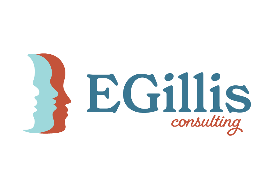
It’s no surprise that Elena, the diversity and inclusion expert, contributed most of the images that would inspire the vector logos I built- and ultimately, the final logo design. We based the logo icons on two concepts: her initials as concentric circles and the very human idea of overlapping people profiles. She also asked me to build my interlocking hands proposal from round 1.
I build the first round of vectors relatively quickly. I hone after the client selects the final ideas. Often, I leave color out until the next step. I try to pick a couple of fonts I like, and it’s surprising how often clients are happy with my first font instincts.

Elena decided the best was last, and sent me this image as a note. I encourage this kind of visual interaction from clients. Most people are more artistic than they realize.

Approach Logo Design as a Part of the Whole Brand
Even if the Client Is Only Asking for a Logo
Next, we explored color and script fonts for the word “consulting”. During out first meeting, I shared my idea to find a way to infuse Elena’s worldly experience into her brand by incorporating photos she has taken across the globe. Her initial inclination regarding her brand colors was to use a gentle color scheme because diversity and inclusion discussions can be hard work. Through conversations she had with me and others about her logo and and branding journey, she realized that the bold and beautiful colors she photographed in her travels belonged in her brand colors. Now she has a brand that confidently embraces her boldness and worldliness.
My motto is “are you ready to get uncomfortable” because this is HARD work. I want people to feel that I will be direct and honest about this, but that I have the emotional intelligence and knowledge to support and create a foundation. They’re taken care of and empowered.
Elena Gillis

In a few short weeks we were able to create a meaningful logo that Elena is proud to have represent her new business. I added meaning by exploring her field, learning about the visual history human rights movements, digging deeper, including my client in the brainstorming process and approaching logo design as a part of that greater whole: the brand. We have created a logo that expresses EGillis authentically and beautifully. Learn more about EGillis Consulting at www.EGillisconsulting.com.

